Al Mitchell
Al & Ted's Excellent Adventure
18 September 2020
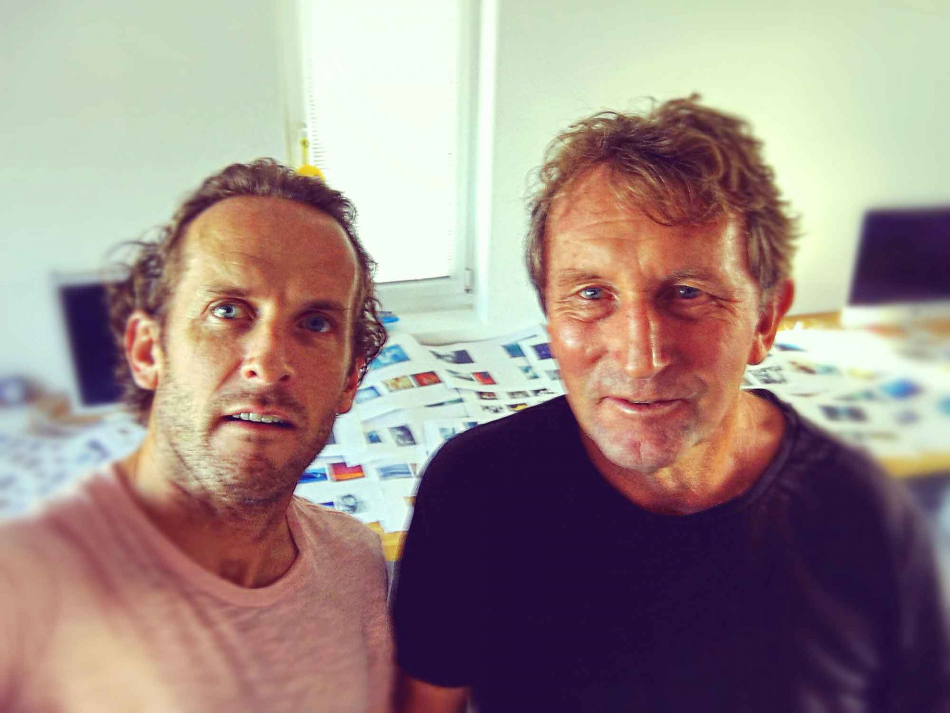
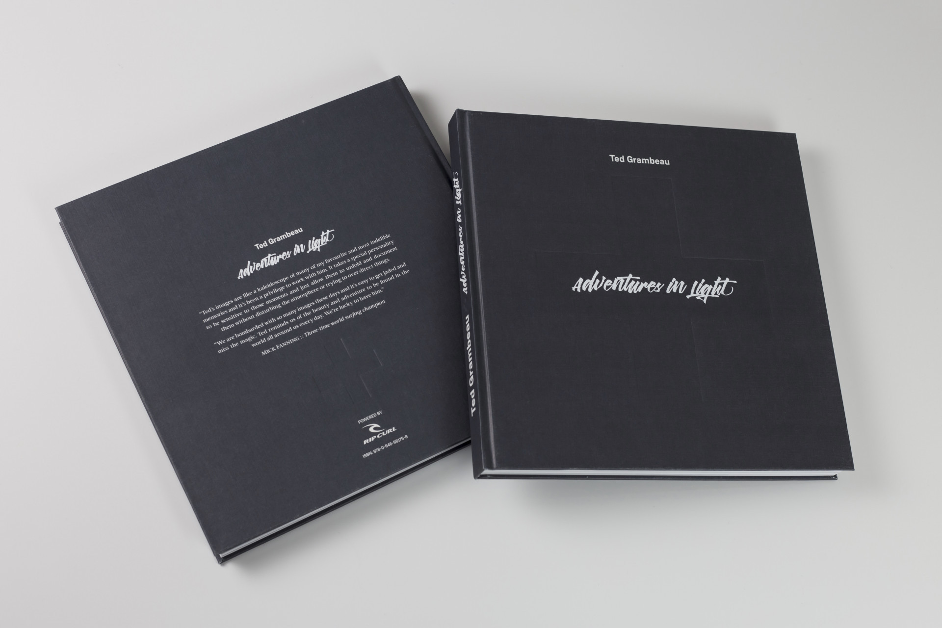
It's been a couple of years now since photographer extraordinaire, and all round total legend Ted Grambeau flew into Guernsey to put together his book with Potting Shed's Al Mitchell. The resulting book has sold incredibly well around the world and we recently had a catch up with Al to talk about the background story to this amazing project.
So Al how did you get to know Ted?
Well I lived in Australia on Queensland's Gold Coast for many years where I worked as a designer at a publishing house called Morrison Media. MM solely published active lifestyle titles, so skate, surf, snow, that sort of thing. After working on a number of the mags, I was given the gig of designing their flagship title Australia's Surfing Life. The mag had a stable of great photographers who were sent out all over the world on assignment but top of the heap and by far the most respected photographer was Ted Grambeau. Ted had trained under Magnum photographers in New York early in his career and gone on to have a highly successful commercial career with clients like Apple, Canon and Speedo that ran alongside his true passion, surfing and his relationship with Rip Curl.
How did the idea for the book come about?
We always enjoyed working together on features for the mag and I think Ted appreciated both my aesthetic eye and how I never butchered his photos with poor cropping decisions. After I left Oz in 2008, we stayed in touch and often talked about doing a big project together. Although books had been done on Ted's work before, he had never had creative control and was never really happy with the outcome. So when Rip Curl, who has had a long standing relationship with Ted, gave him the go ahead he got in contact with me and we met up in Portugal with journalist Tim Baker, who was himself an editor of Australia's Surfing Life.
Tell us about design process for the book.
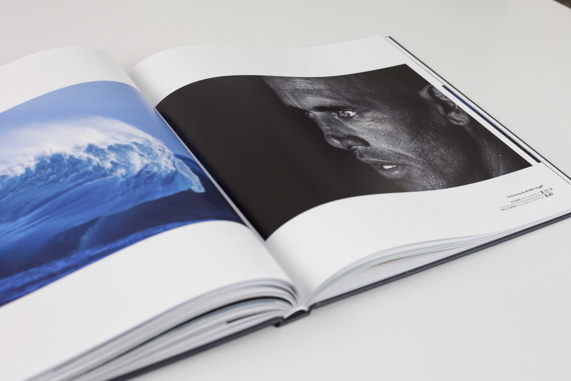
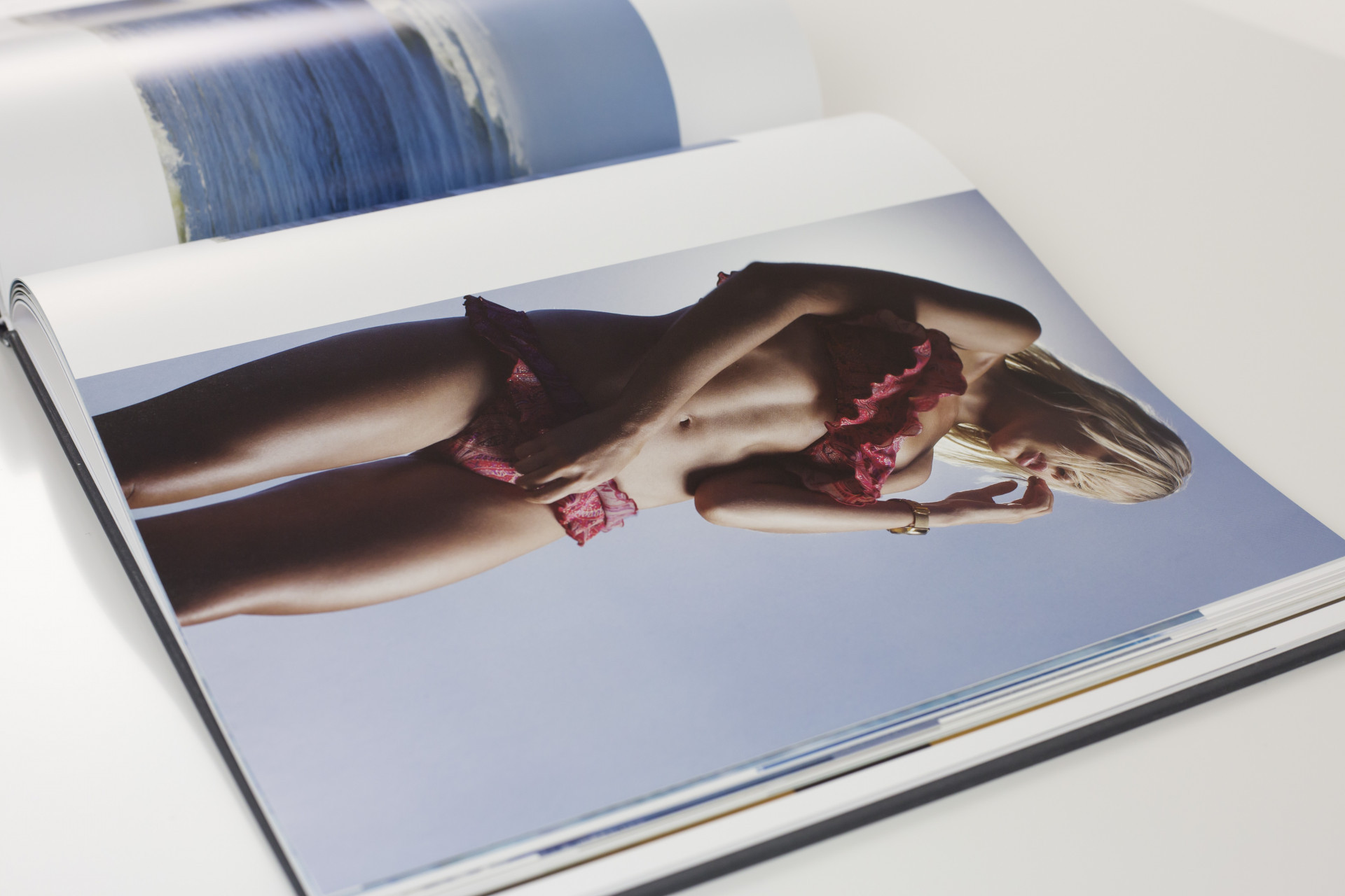
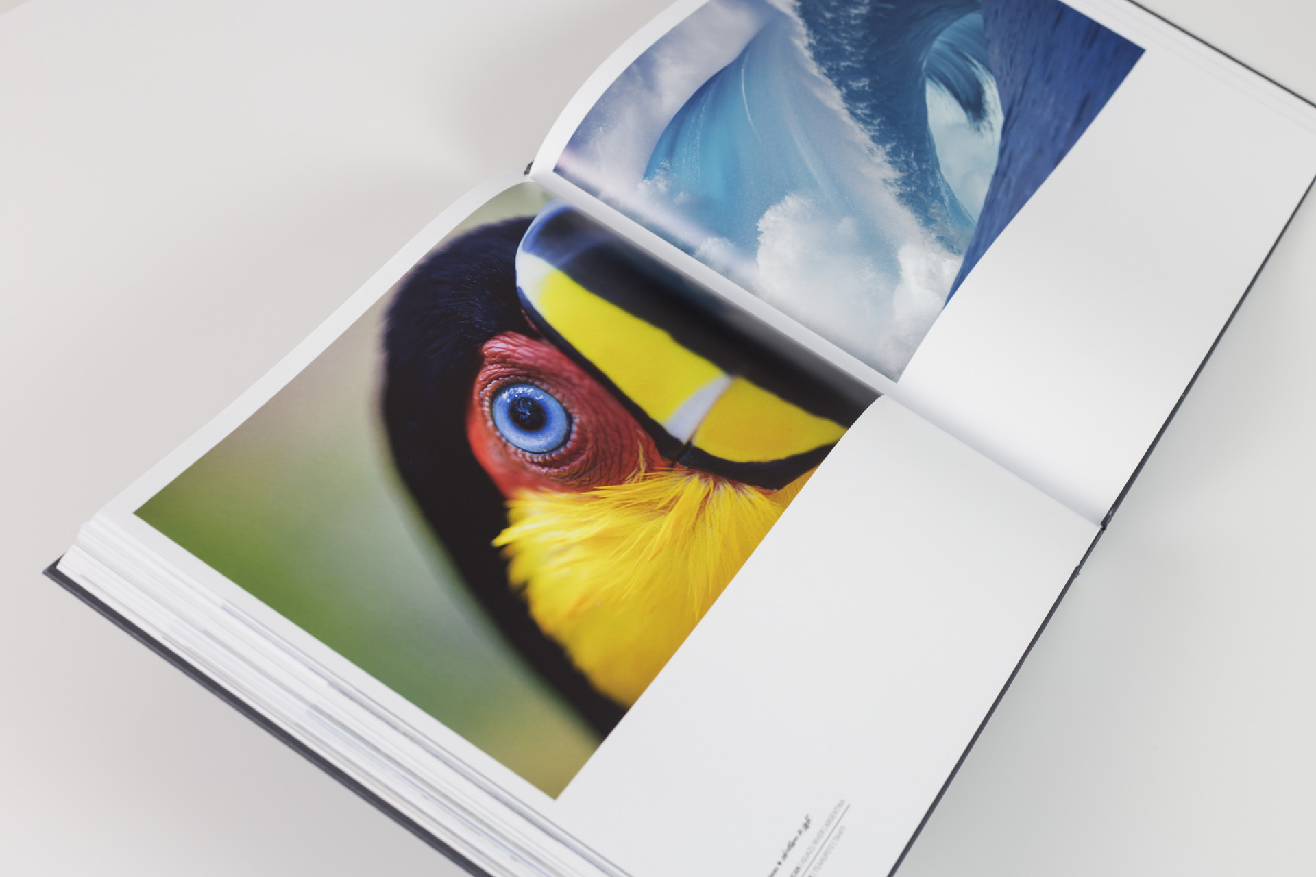
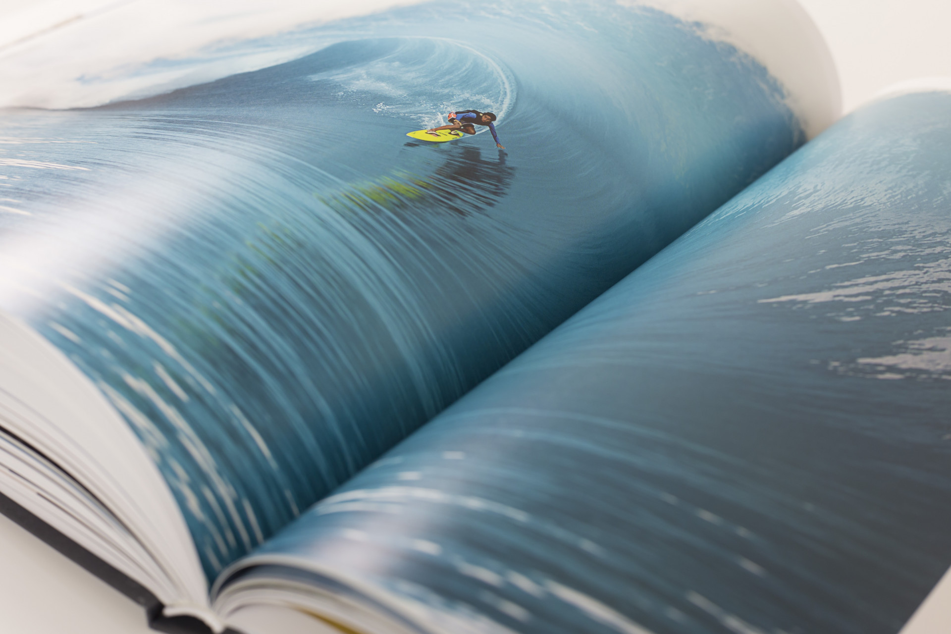
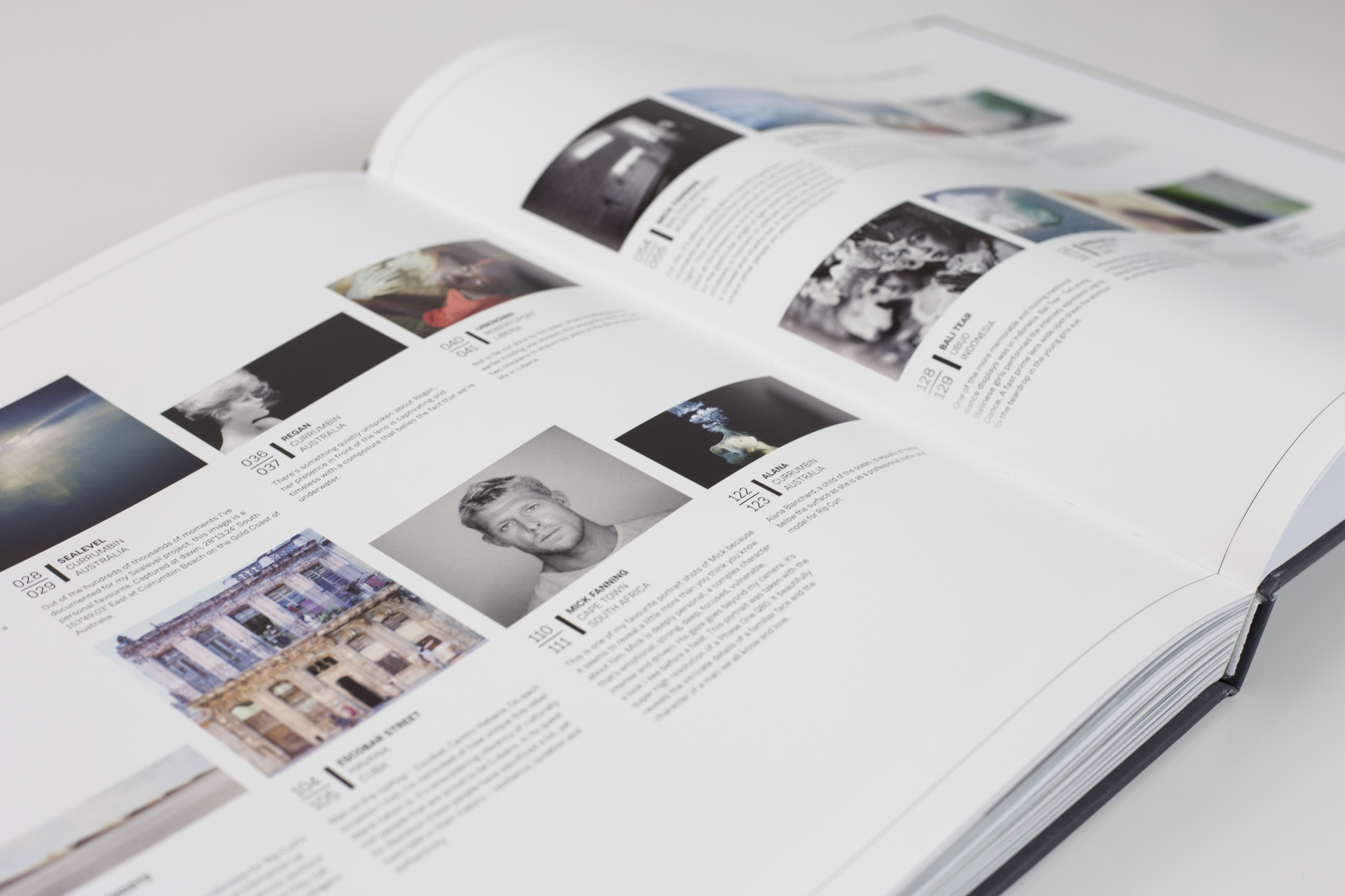
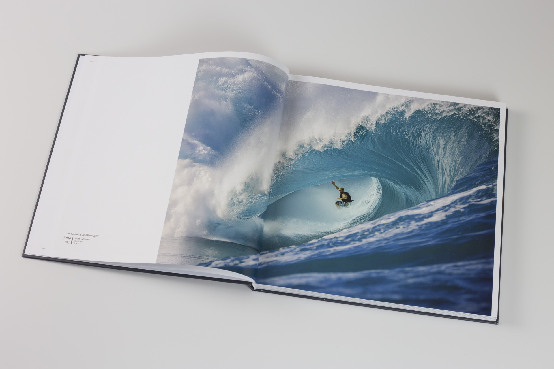
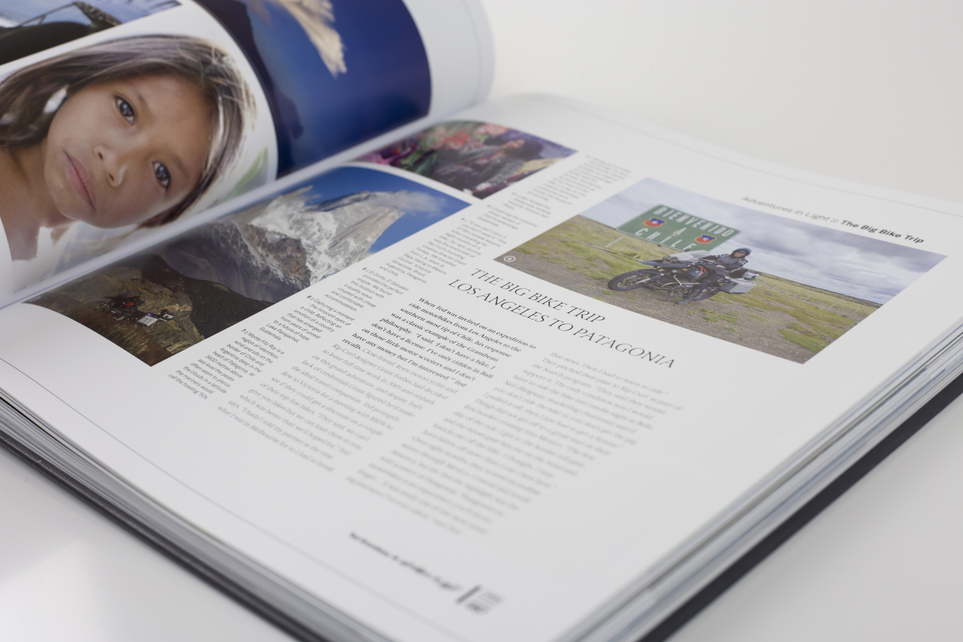
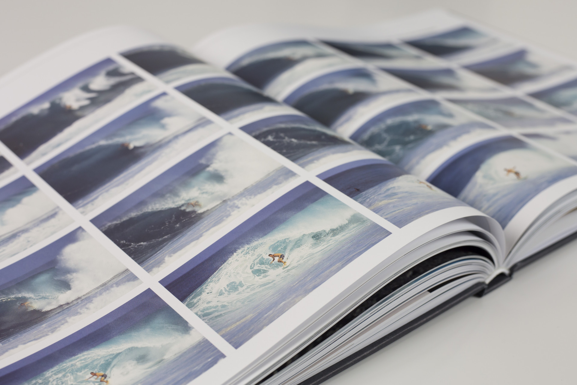
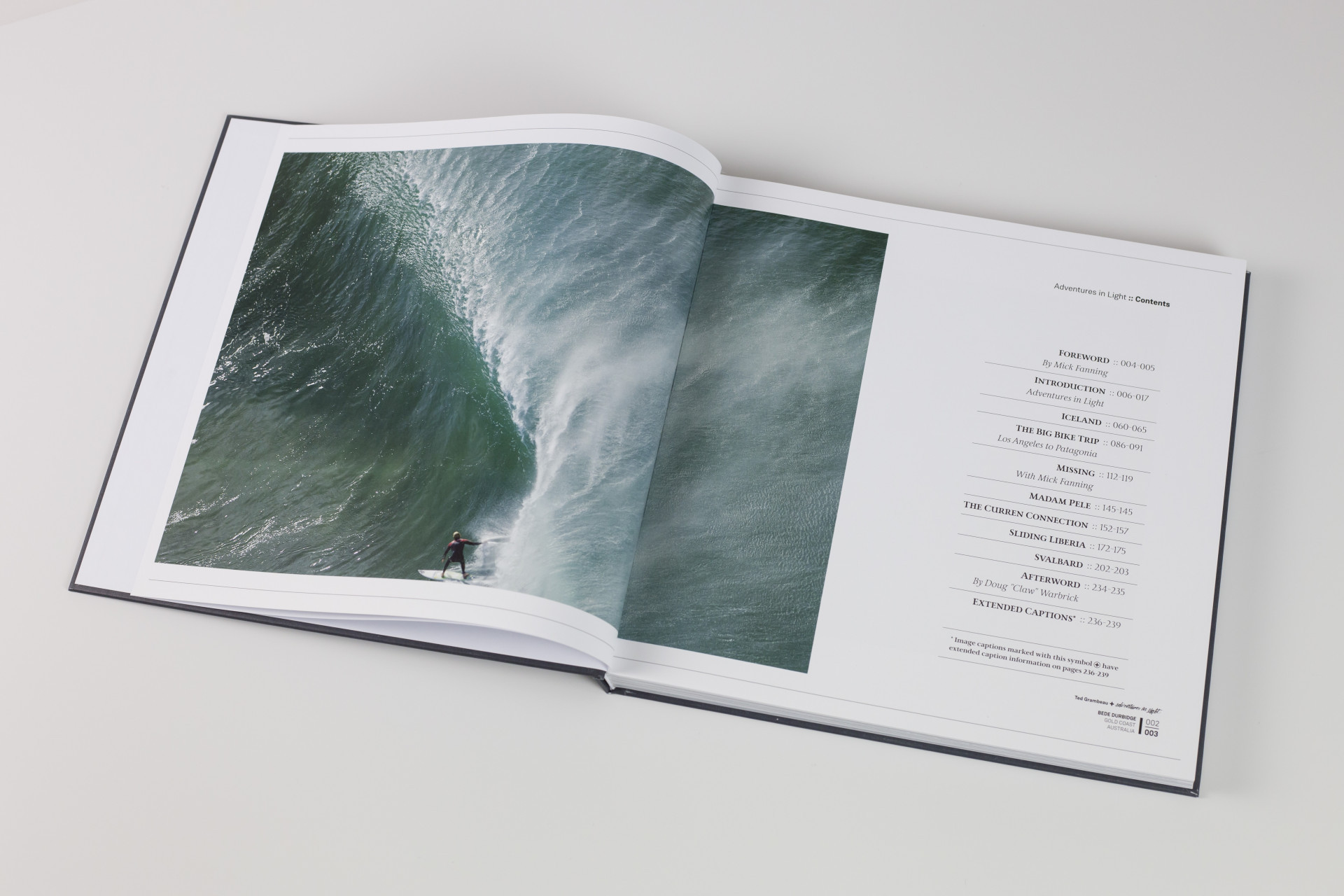
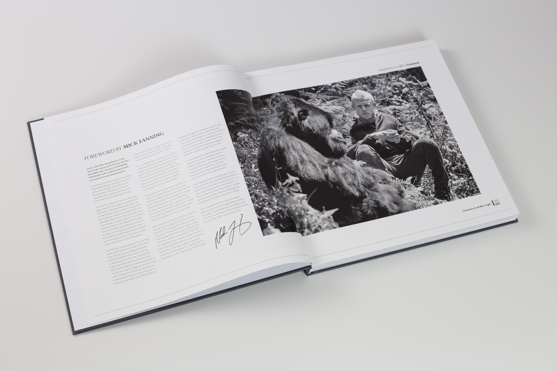
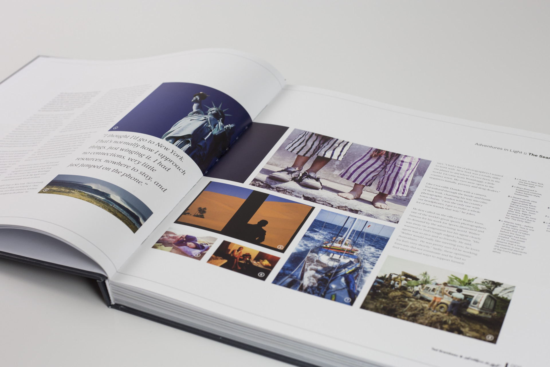
Well Ted flew over to Guernsey from Australia on his way through to god knows where. He had already sent over a drop box with literally hundreds (if not thousands) of jaw dropping images and I had done a very rough edit before he got here, but I still had enough images to fill 10 books. It was agony cutting images that would make it onto the cover of most magazines. I had started to pair the images that might work on spreads, the idea being to juxtapose contrasting elements: light and dark, colourful and mono, huge and tiny, brutal and gentle etc. These large scale photo sections were then interspersed with more editorial sections featuring stories from Ted's travels written by Tim Baker.
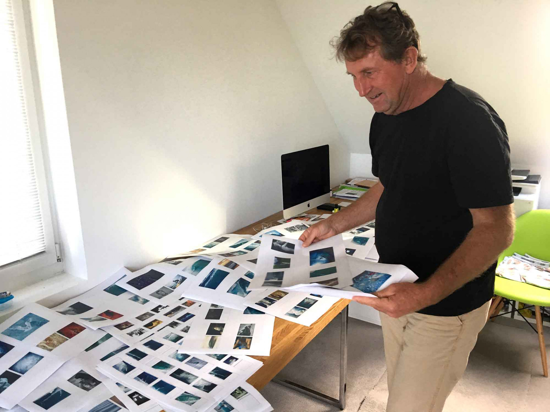
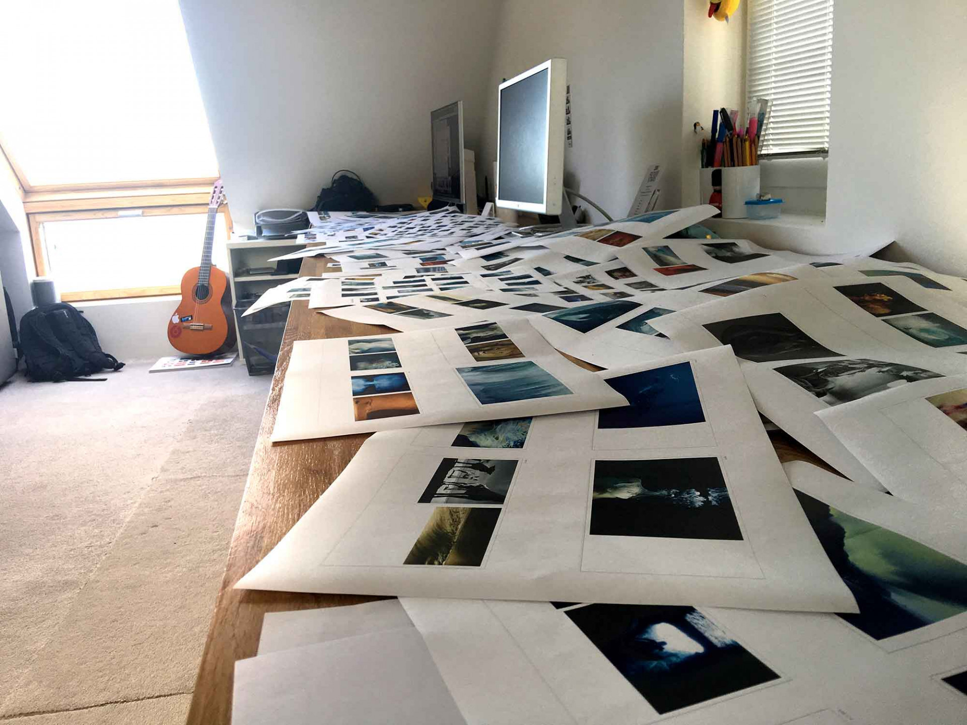
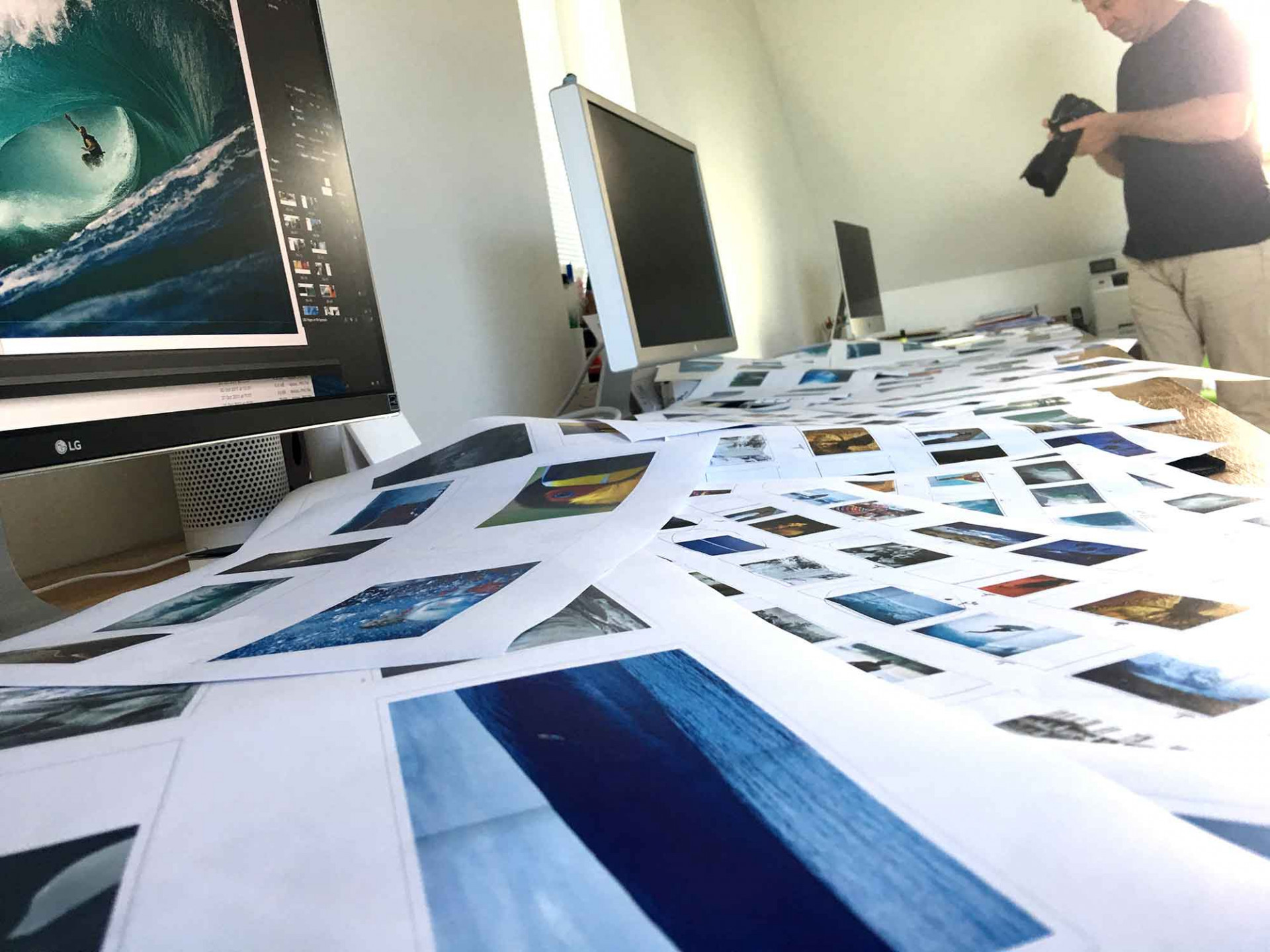
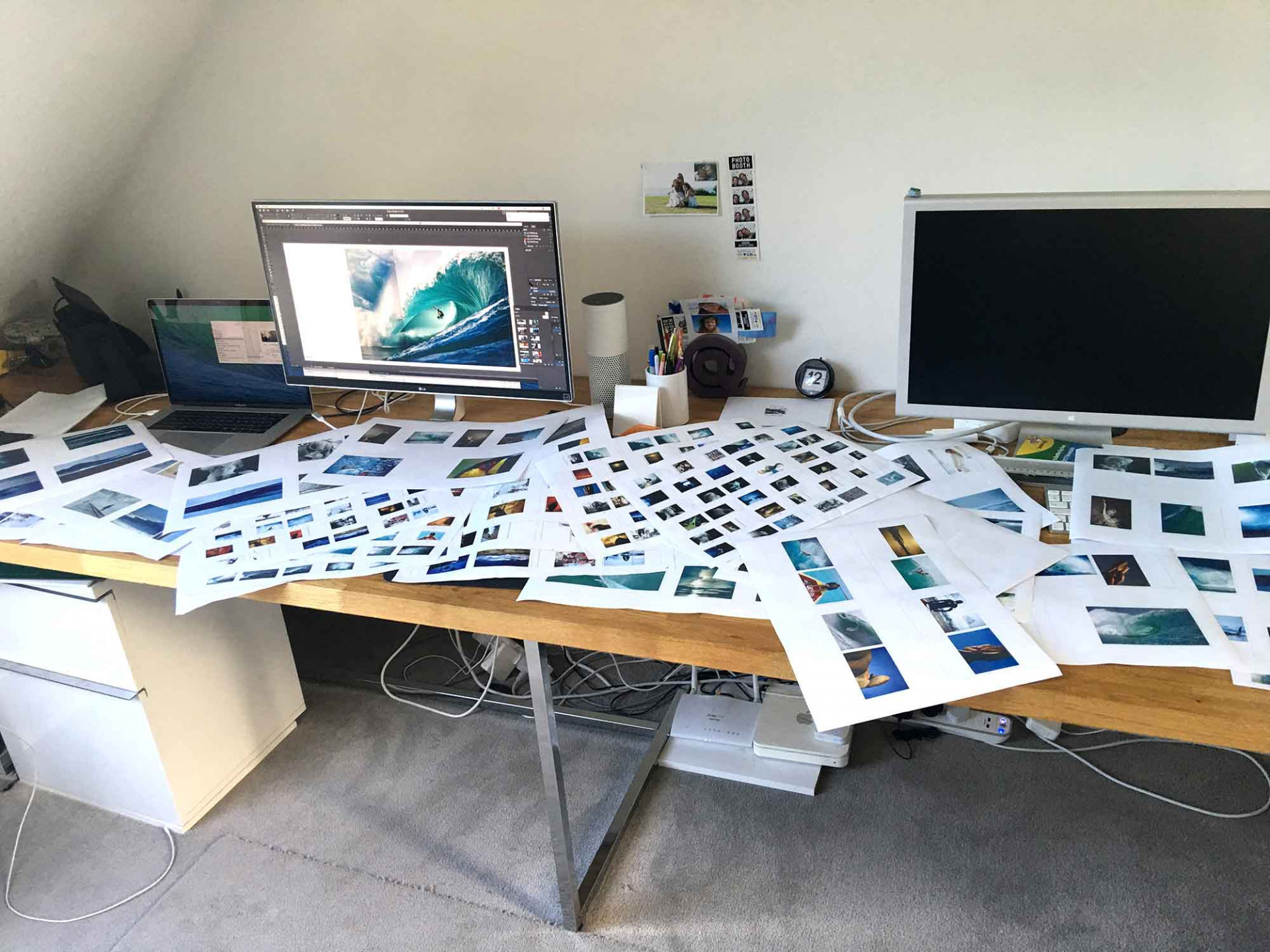
By far the hardest part of the design process of this book was the edit. So once Ted and I were in the same room we printed out all the images (sorry trees), shut ourselves away in my office at home for a few days, spread them out on the floor, walls and every available surface and argued the case for each and every image. In the end, we had our selection.
So that's the edit but what about putting it all together?
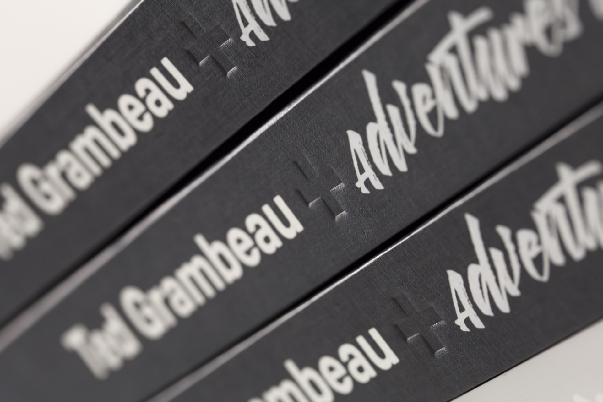
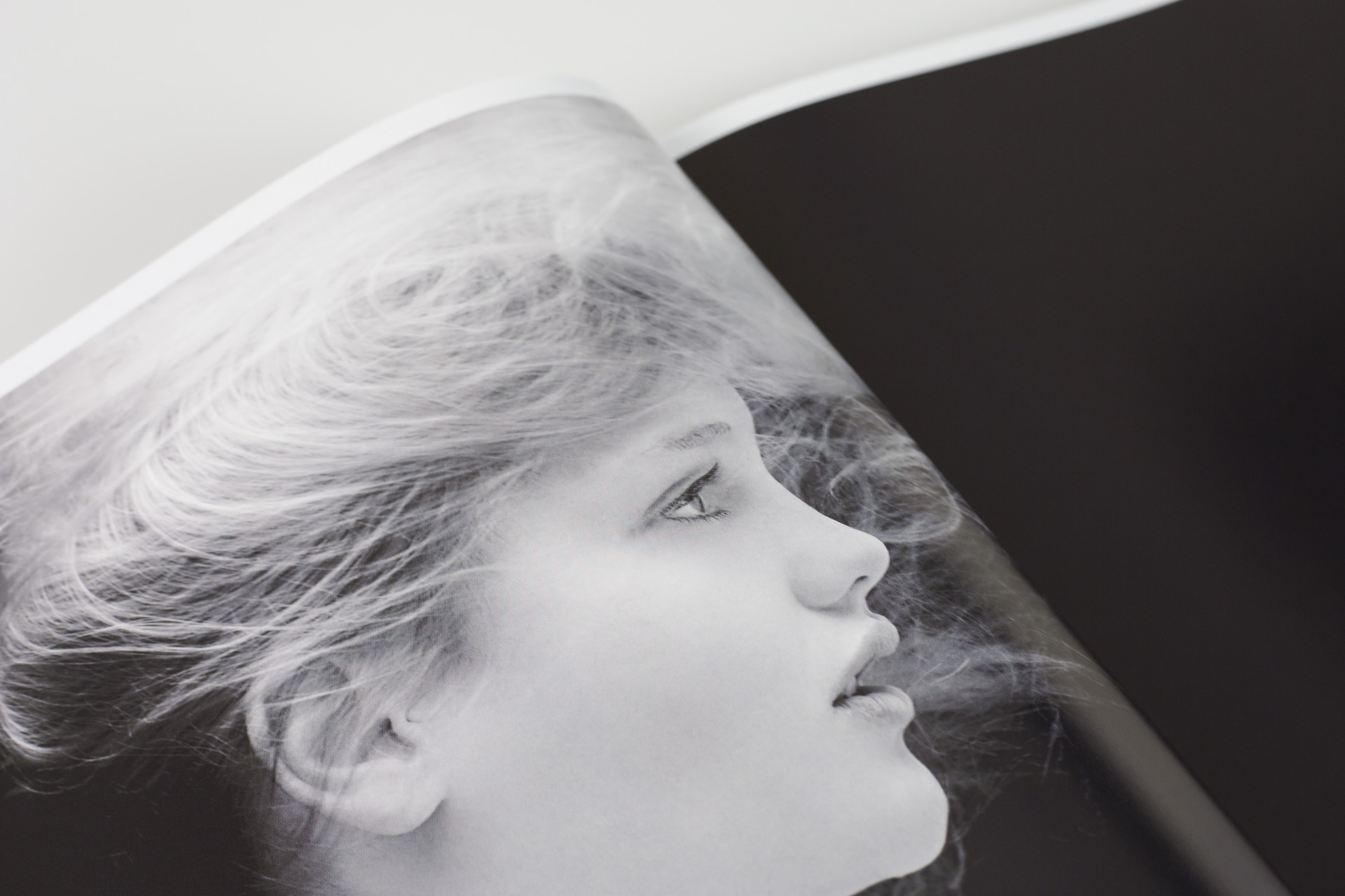
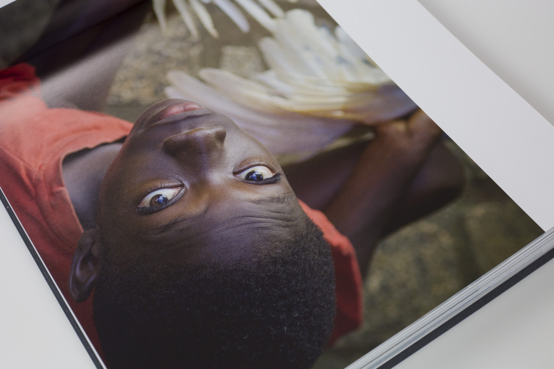
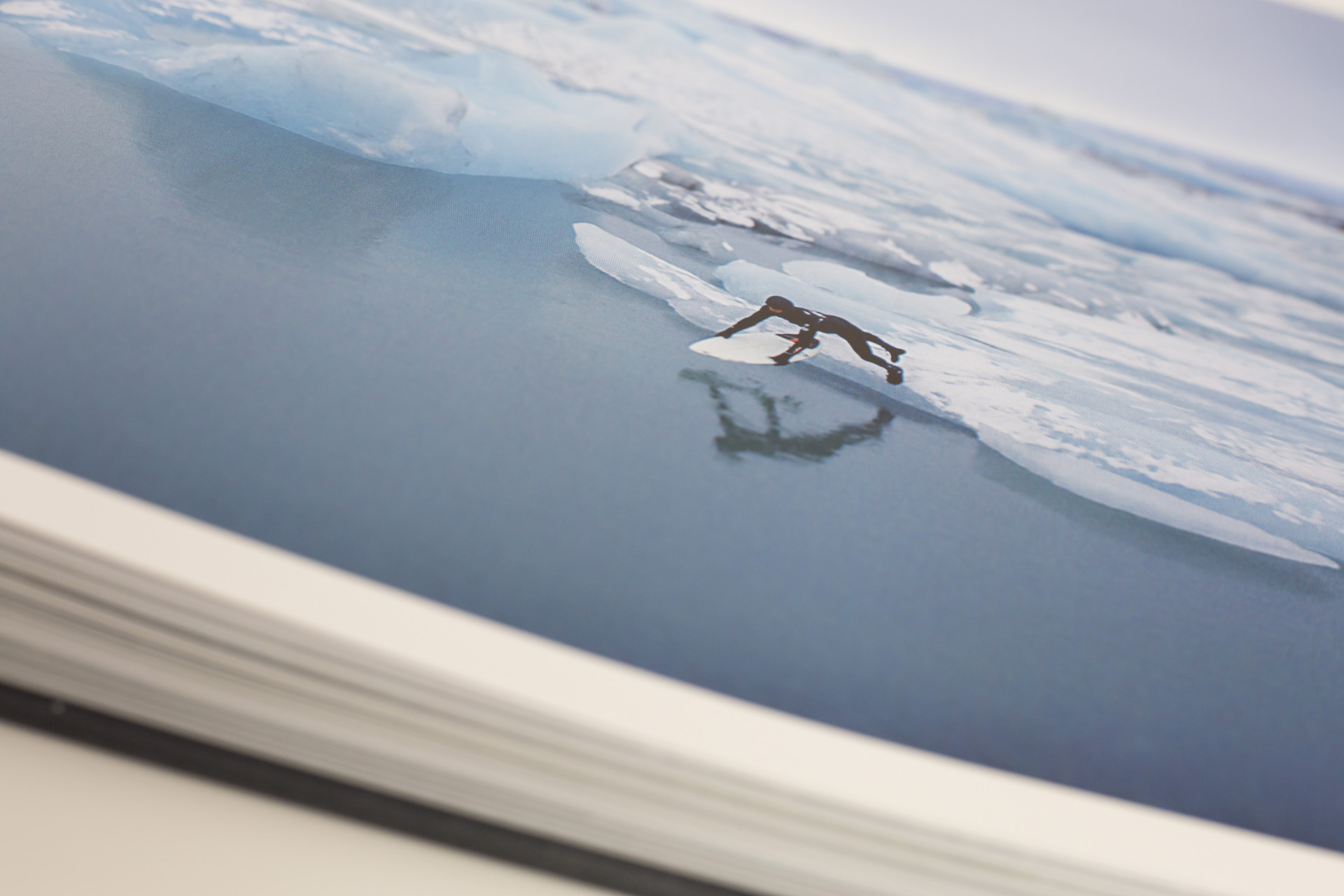
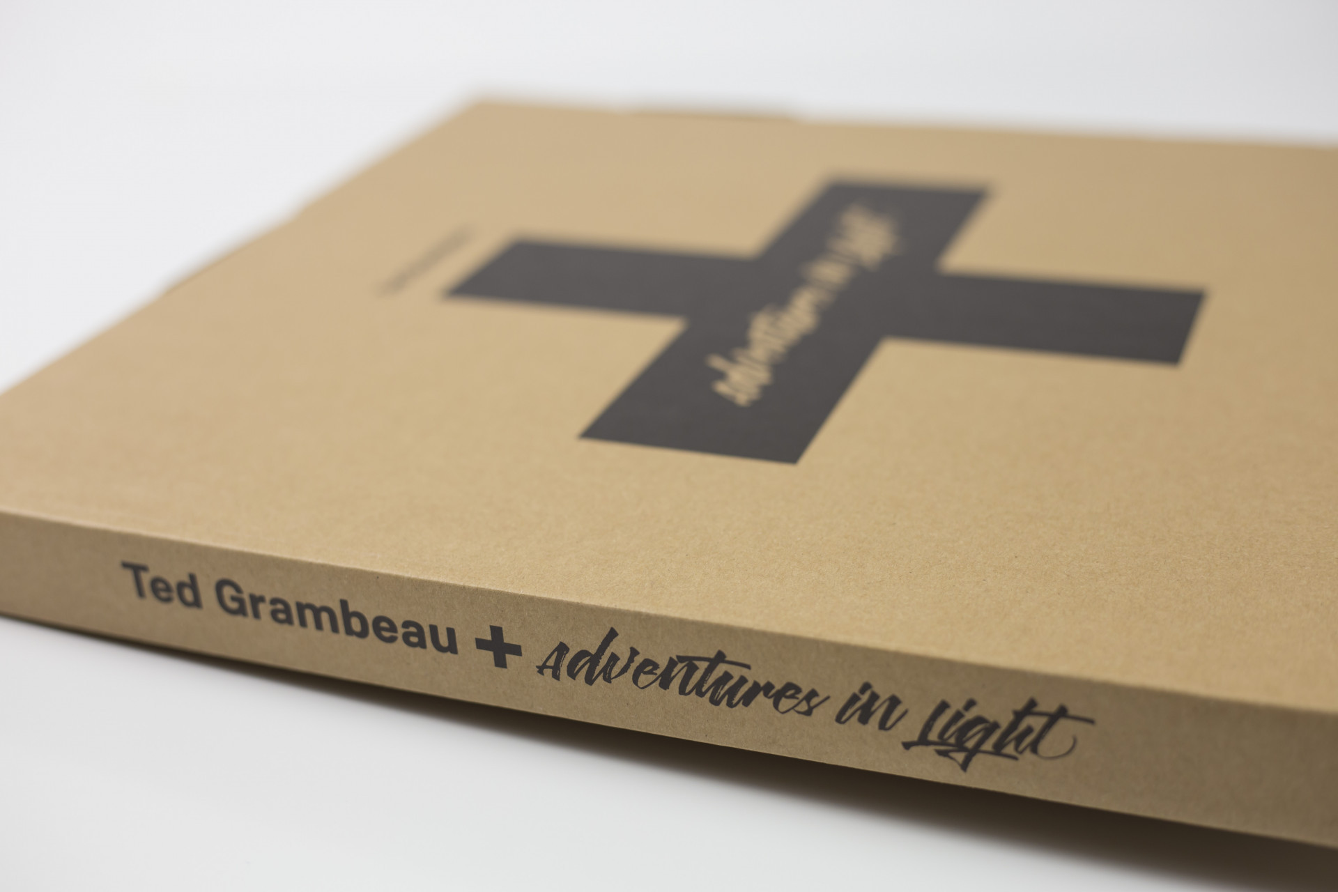
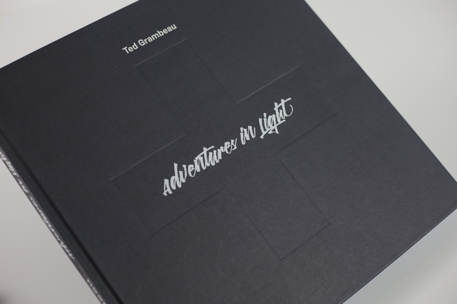
Well when you have material like I had it's more a case of keep it simple and get the hell out of the way of the images, they're the stars of the show after all. Too many graphical gymnastics would just be an insult to the photography so this was very much an exercise in reduction. Also, the book was soo full of colour thanks to the images that I decided to make the typography totally monochromatic and the cover extremely subtle, as if it was a box hiding a treasure trove of colour within.
So what did Ted make of Guernsey?
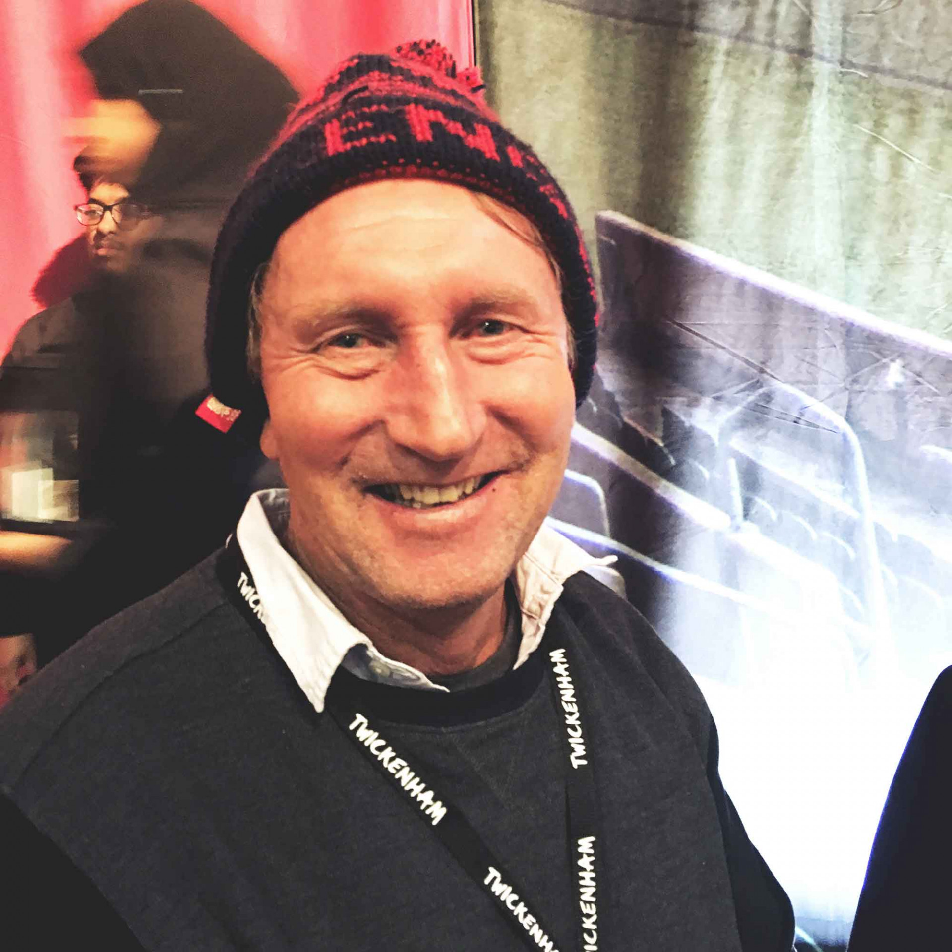
Oh, he loved it and he even managed to pop into Ladies College to do a talk for some of the islands 6th form photography students which totally blew them all away. To say thanks for flying over, I took Ted to Australia vs England at Twickenham on the way back. Unfortunately for him, England soundly beat them and as a forfeit he had to spend the rest of the day in an England hat and scarf. Which, as always, he carried off with style!

Testimonials
"Potting Shed took the time to understand the product and our purpose and created a clean, fun and fresh look which our clients comment on regularly. They then took the brand and product to the next level for us by creating our product video and website, and the storyboard and visual process that the team created really brought it to life."

Jenny Winspear
COO Anova
"We worked alongside Potting Shed to create an identity that embodies who we are, and why we do what we do. These projects have contributed to a more connected team who believe in our organisation at a deep level. When your people believe in what you do and take ownership over their culture and workplace, growth is the natural outcome."

Jim Gilligan
CEO Carey Group
"Potting Shed responded quickly and sensitively to our brief, helping us find a tone of voice we're genuinely proud of. Their promptness and understanding made a real difference – 10/10 for quality, service, and value."

Jay Goss
Bank Aston
