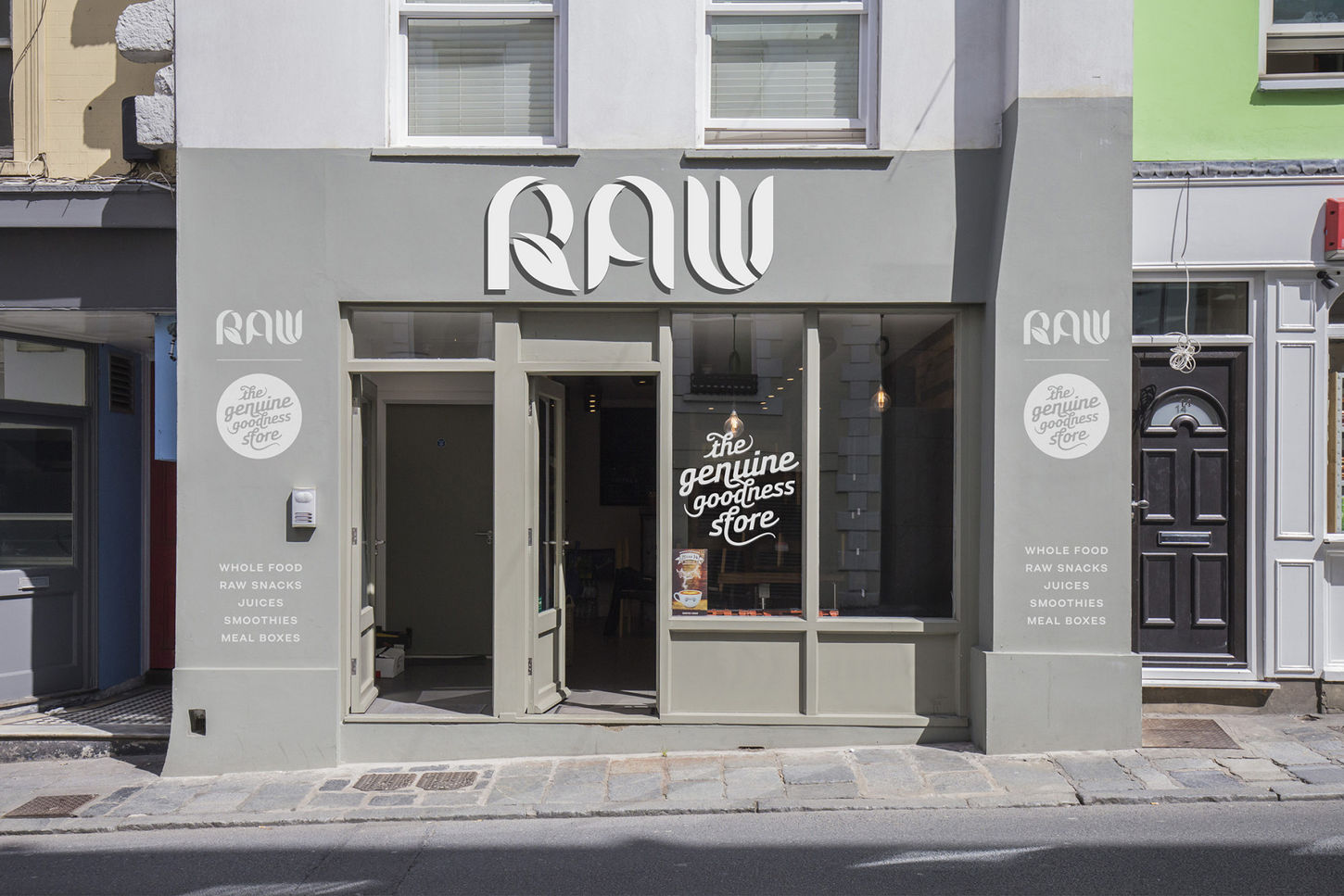
The Raw Store
A Raw Deal
Project overview
Good food inspires, so when part of the deal for The Raw Store's new logo was paid by way of a company wide tab we knew it was a winner.


Project details
It was vital the brand could quietly roll out across Joh's store organically, so that he could take control of a bullet proof solution independently, without the need for design knowledge and flourishes, letting the logo do all the work.
This led to a mono logo with a stencil feel that could be applied to all manor of collateral in a range of mediums, from packaging to apparel - staying true to the brands natural and organic roots.
Geometric hard edges of chopping block efficiency are met with flowing curves to visually marry the science of nutrition with a gentle nature, becoming a biographic marque of Joh himself.
A thoroughly satisfying project and meal.


