Gareth Rowson
Democracy is a Design Problem
15 November 2018

How UX design theory is being applied to voting ballots.
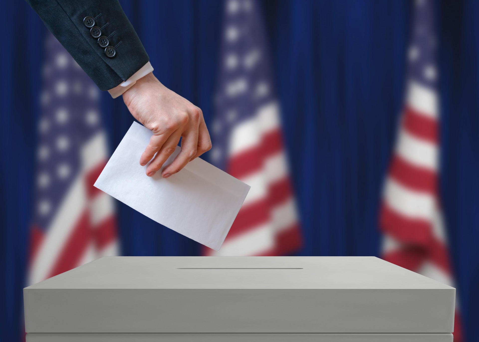
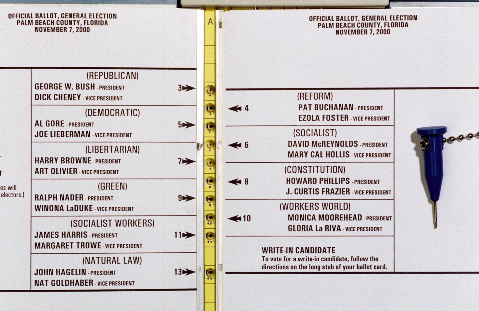
It’s hard to forget the 2000 US Butterfly Ballot design which arguably delivered ultimate failure to that year’s electoral vote. In an attempt to provide the ultimate design solution for voting equality, this rather epic fail will now sit in the archives of ‘political disasters’. People were convinced they were voting for their beliefs when in fact they could have been voting for the polar opposite. To that end, democracy and equality is a design problem and not an easy one to solve. This is why the design methodology of UX or ‘User Experience’ is finally and very necessarily being applied to voting ballots.
There are many meaningful pieces of paper in the world but it could be argued that there is no other more vital than the US voting ballot year on year. There are so many psychological factors and variables influencing the design, delivery and disposition of this document. Hence the efforts of 2 UX designers Whitney Quesenbury and Dana Chisnell of The Center for Civic Design who are ploughing all their efforts into this project. They are looking at the ‘whys’ behind voter fall outs (lack of engagement), avoiding the short comings of 2000 and using their UX skills to ensure that a democratic approach to voting is achieved.
This culminated on their ‘Field Guides for Ensuring Voter Intent’ which they presented to Kickstarter giving a blue print to voting design. They refute the lazy notion that non-voters are simply appathetic and focus on the idea that design could be disenfranchising this part of society. It’s safe to say that design can solve these problems and by opening up the theories globally they can produce fairness and representation in voting.
Big ups to Whitney Quesenbury, Dana Chisnell and Emily Ludolph’s great article on 99u who brought this great idea to our radar.

Testimonials
"Potting Shed took the time to understand the product and our purpose and created a clean, fun and fresh look which our clients comment on regularly. They then took the brand and product to the next level for us by creating our product video and website, and the storyboard and visual process that the team created really brought it to life."

Jenny Winspear
COO Anova
"We worked alongside Potting Shed to create an identity that embodies who we are, and why we do what we do. These projects have contributed to a more connected team who believe in our organisation at a deep level. When your people believe in what you do and take ownership over their culture and workplace, growth is the natural outcome."

Jim Gilligan
CEO Carey Group
"Potting Shed responded quickly and sensitively to our brief, helping us find a tone of voice we're genuinely proud of. Their promptness and understanding made a real difference – 10/10 for quality, service, and value."

Jay Goss
Bank Aston

