PottingShed
A Spotlight on Hawksford
15 May 2013
TPS has been appointed to design the next generation of Hawksford's brand language.
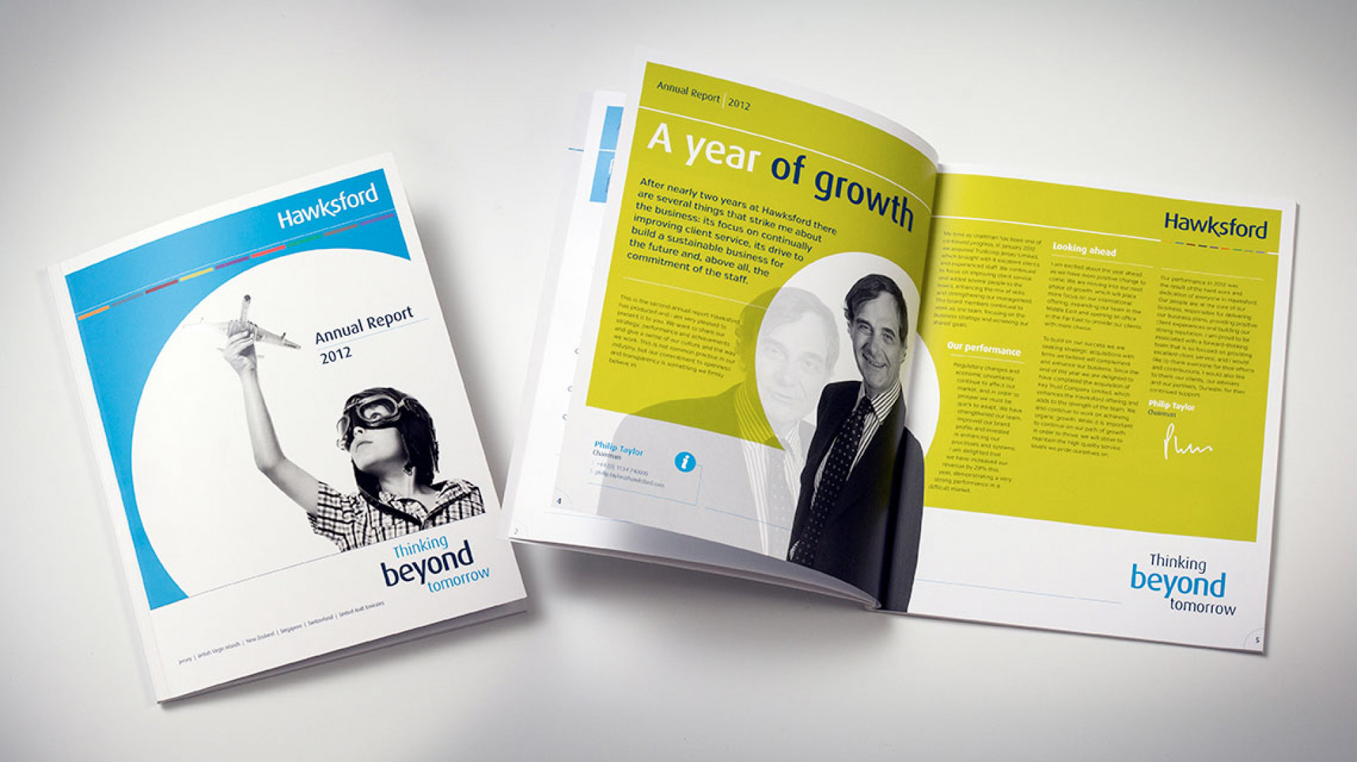
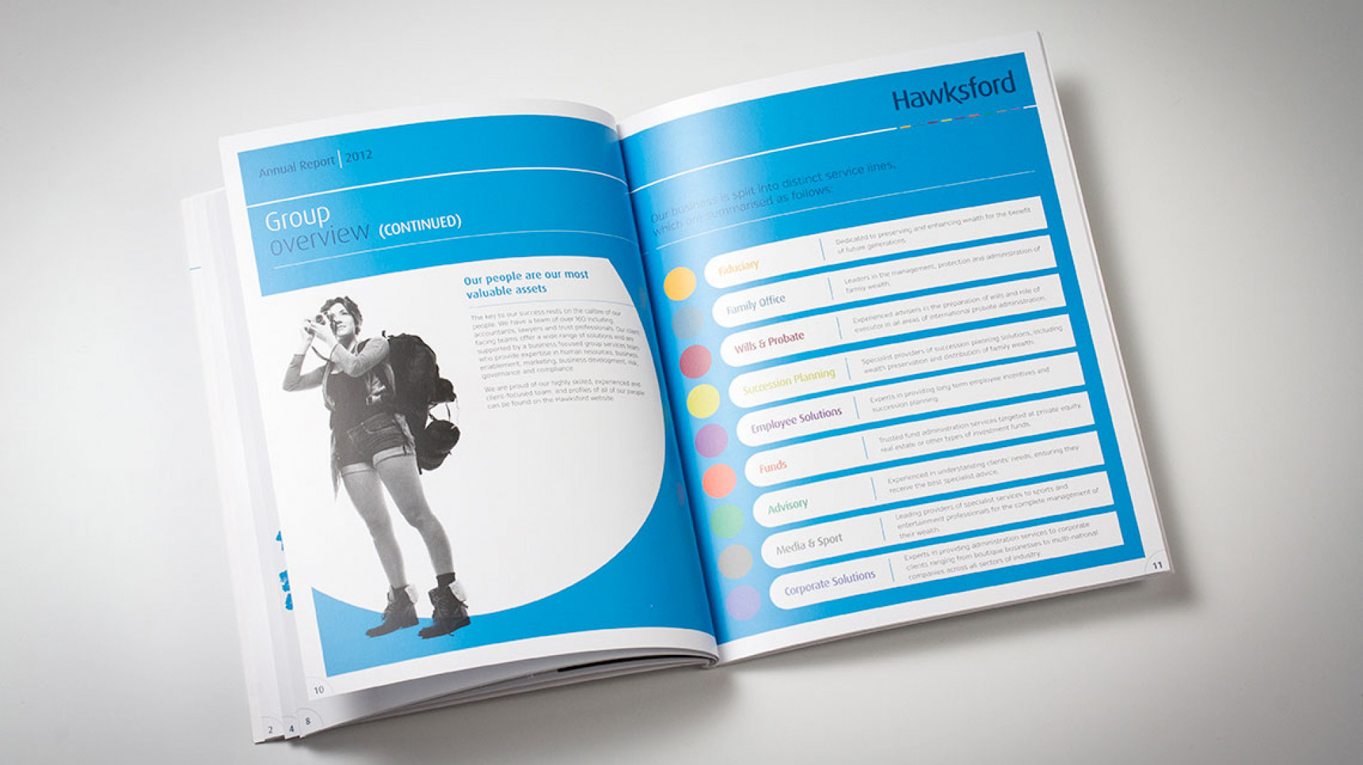
The brief was to evolve their award-winning brand into a new direction. With a host of dynamic brand aspects to build upon we learnt very quickly that their staff and client focus was paramount to everything they do. We injected a wider and more dynamic usage of their sub-product colours and introduced spotlighting onto their imagery.
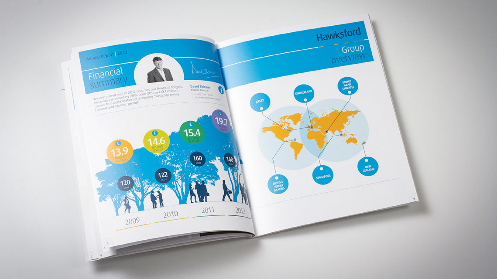
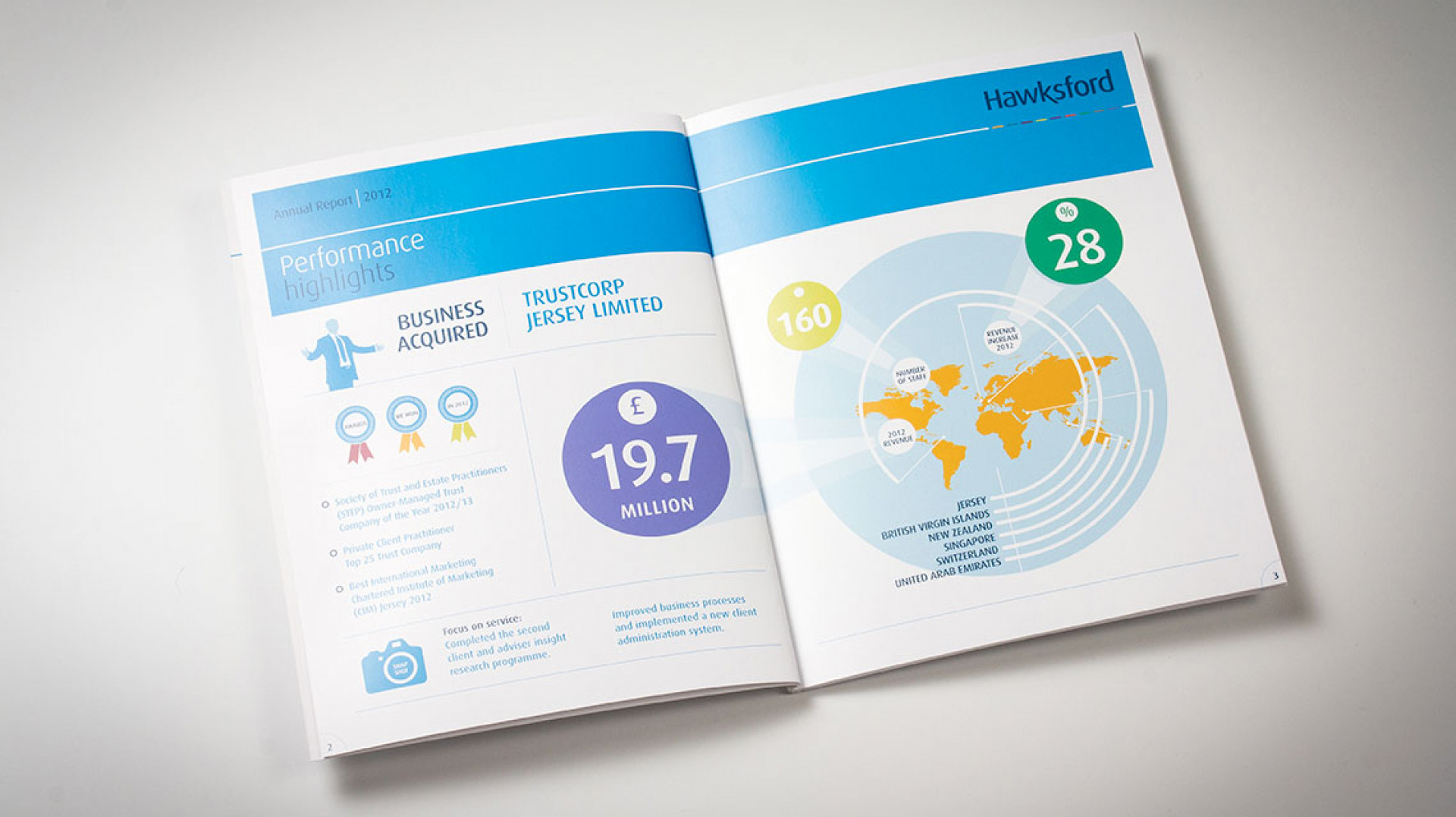
This alongside the development of a comprehensive set of info-graphics in their annual report to highlight key performance figures and stats helped the brand come alive once more . Finally, we added another dimension to the report by animating it for use online through their Youtube channel.
The ever-dynamic brand and marketing team at Hawksford made sure creativity was married with function at every level of this project and the results show.

Testimonials
"Potting Shed took the time to understand the product and our purpose and created a clean, fun and fresh look which our clients comment on regularly. They then took the brand and product to the next level for us by creating our product video and website, and the storyboard and visual process that the team created really brought it to life."

Jenny Winspear
COO Anova
"We worked alongside Potting Shed to create an identity that embodies who we are, and why we do what we do. These projects have contributed to a more connected team who believe in our organisation at a deep level. When your people believe in what you do and take ownership over their culture and workplace, growth is the natural outcome."

Jim Gilligan
CEO Carey Group
"Potting Shed responded quickly and sensitively to our brief, helping us find a tone of voice we're genuinely proud of. Their promptness and understanding made a real difference – 10/10 for quality, service, and value."

Jay Goss
Bank Aston
